Project Background
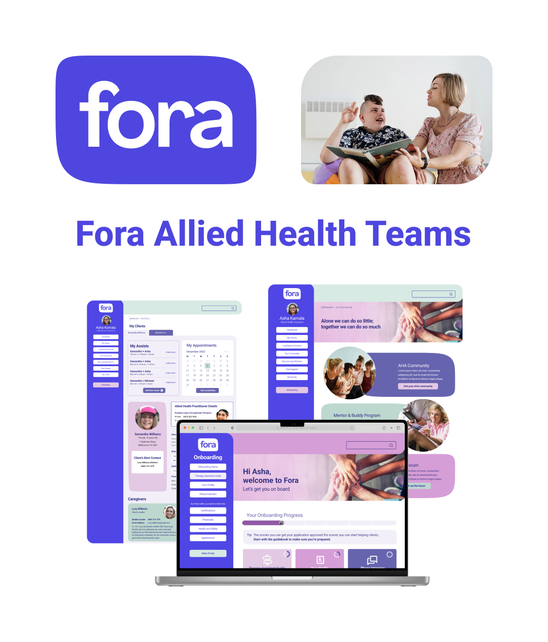
Fora is an Australian healthcare provider that employs over 300 allied health assistants (AHA) & allied health professionals (AHP) who provide therapy & assistance to clients living with a disability.
Team:
• Jimmy Hua (Project Lead + UX/UI Designer)
• Andy Szetho (UX/UI Designer)
• Alex Stylianou (UX/UI Designer)
• Angelo Delmastro (UX/UI Designer)
• Clare Tang (UX/UI Designer)
• Lawrence Fung (UX/UI Designer)
• Natalia Romero (UX/UI Designer)
• Sarah Elllis (UX/UI Designer)
• Steph Judd (UX/UI Designer)
Fora Team:
• Dr. Sam Donegan (CEO & co-founder)
• Bec Khor (Principal UX/UI Designer)
• Nikita Fernandes (COO & co-founder)
• Alessandro Biavati (Lead Engineer)
• Felicia Suwignjo (Customer Success Team)
• Annabel Parkin (Customer Success Team)
My Responsibilities:
• Leading a Team of 9 UX/UI Designers
• Stakeholder Engagement & Management
• Project Management & Tracking (via Trello)
• Delegating Roles & Responsibilities
• Overseeing all UX Phases & Deliverables
• Hosting & leading daily stand-up meetings & WIPs
• Organising & Scheduling Interviews & Workshops
• Presenting back to the client
UX responsibilities:
• Surveys (questions, format, distribution)
• Interviews (conducted 3, creating questions & format)
• Desktop Research (competitive & white paper analysis)
• Synthesising Research Data
• Facilitating Co-design / Ideation Workshops
• Minimum Viable Product (MVP) & Information Architecture
• UX Copy, Content & Writing; Proof & Editing
• Usability Testing Workshops (conducted 2, writing script & insight synth)
UI responsibilities:
• Sketching UI & Wireframes
• UI Prototyping & Iterations (low, medium & high fidelity)
• Accessibility Analysis (W3C WCAG 2.1)
Tools: Figma, Miro, Trello, Photoshop, Figjam, Pen & Paper, Slack, Zoom, Canva
Platform: Desktop Web (77% of allied health assistants preferred laptop & desktop to access the Fora platform)

The initial brief revolved around the concerning statistic that 50% of matches between allied health assistants & clients living with a disability were failing within a month. Fora felt a few specific factors were responsible for this:
Key information being missed by AHAs in onboarding.
Initial Client Brief
Slim onboarding manual & guides potentially missing key topics.
Onboarding missing a fun & digestible feel, thus contributing to important details being glanced over.
Discovery / User Research
I contributed to & carried out the following tasks in the discovery / research phase:
Created survey questions
Created interview scripts
Interviewed 3x AHAs
Analysed 1 academic paper
Competitive analysis
Synthesising & affinity mapping insights
After discussing the brief as a team, we formulated our surveys, interview scripts and conducted the following research:
Surveyed 13 AHAs
Interviewed 15 Allied Health Workers, including 9 Fora AHAs,
2 non-Fora AHAs, 2 Allied Health Professionals,
2 Fora Customer Success employees
Analysed 6 Competitors
Analysed 2 Academic Research Papers
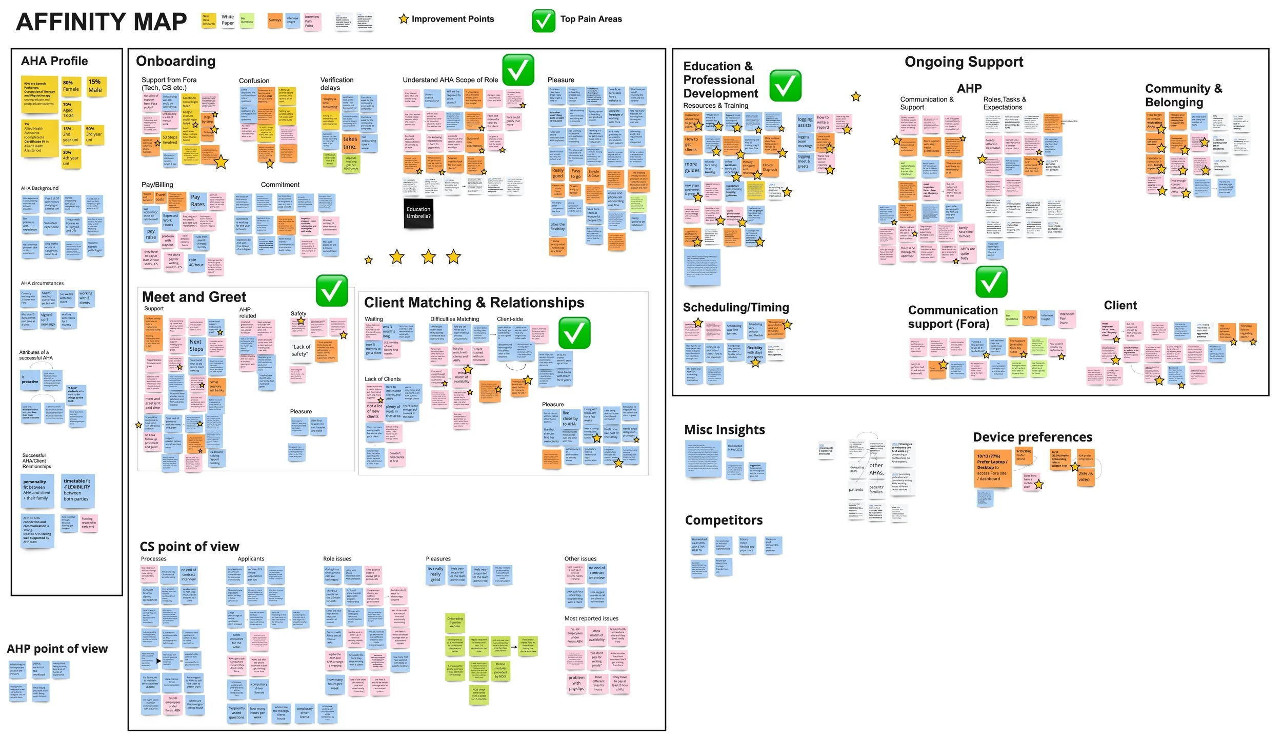
Upon summarising & synthesising the quantitative & qualitative insights gathered from our research, we uncovered themes around pain points AHAs were experiencing which might be accounting for AHA & client matches failing:
Feeling isolated from other allied health workers and Fora i.e. feeling a lack of community.
AHA Scope of work being ill-defined. They’re sometimes seen by the client as ‘carers’ rather than health professionals.
A need for professional development and better ongoing education.
Client matching process lacking due to client profiles missing key information (e.g. about family & household) and long wait times for matching
AHAs felt anxious & unsafe at the initial meet & greets
Upon taking a step back to soak in all the research, we came to realise a pivot in the problem space that was radically different to the initial brief which focused primarily on onboarding.
This brought us to our new problem statement:
Problem Statement (Pivot)
Allied Health Assistants new to Fora feel anxious about working with clients and require more ongoing support and education but experience feelings of nerves around initial meeting the client, inadequate client matching, clients misunderstanding AHA roles & feeling of isolation due to a lack of community.
Defining the Problem
I contributed to creating these artefacts in the definition phase:
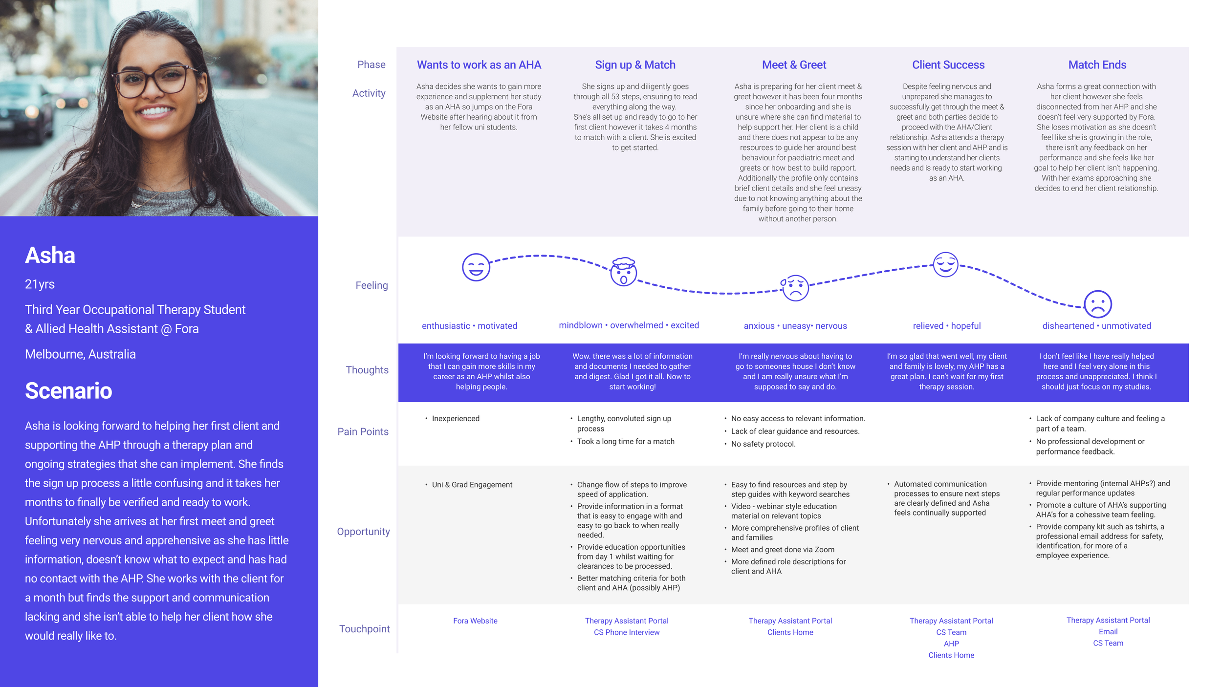
Persona
Journey Map
How Might We (HMW) Statements

Armed with our new problem statement upon collating the research, we formulated all of this into a persona & journey map to more succinctly present our findings back to the client:
At this point, we sat down as a group with Fora and came up with 2 ‘How Might We’ statements to bring into ideation workshops with our Asha’s in order to generate design ideas & solutions to address the newly defined problem space:
How might we better prepare Asha for client relationships so she feels confident?
How Might Fora help Asha feel like a valued, supported & committed member of the team?
Designing the Solution
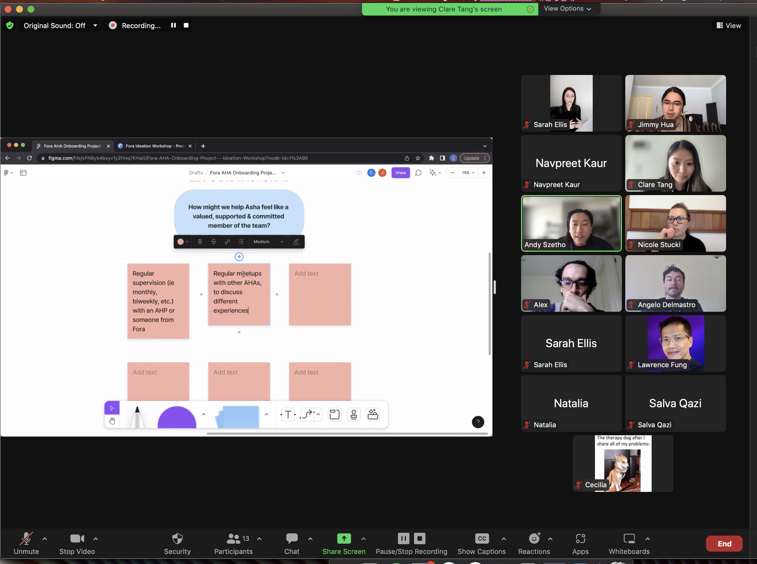
I co-hosted an ideation workshop with 4 Asha’s running through a couple of activities (crazy 8s & brainstorms) with the HMW statements as prompts. Dozens of ideas were generated, voted on, then tentatively mapped onto a minimum viable product (MVP) matrix.
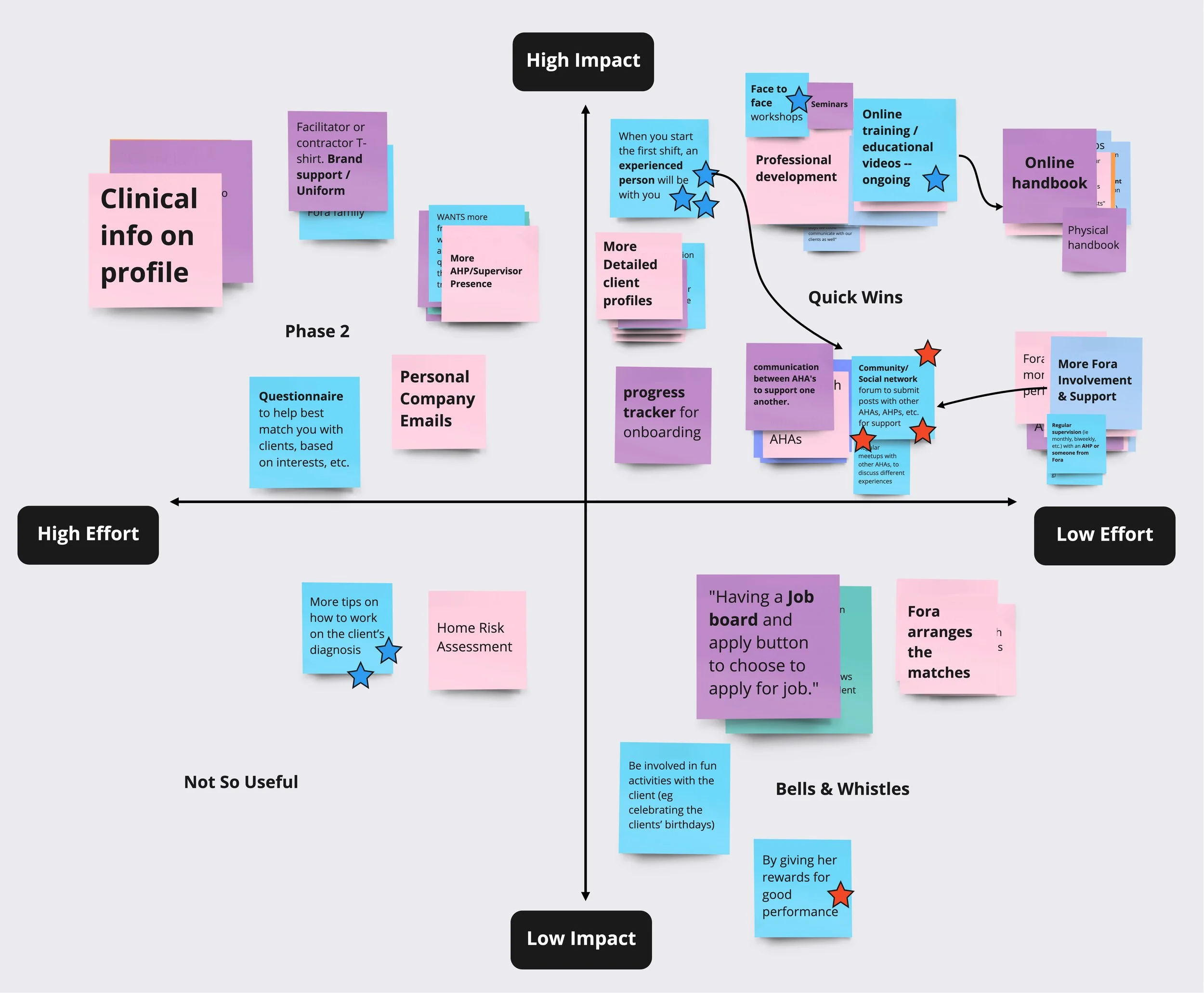
I then organised a meeting with Fora to discuss & ensure all the features ideated in our workshop were placed appropriately in terms of effort, cost & impact on the matrix, before moving on to mapping out the best features (high impact features) into user flows & an information architecture.

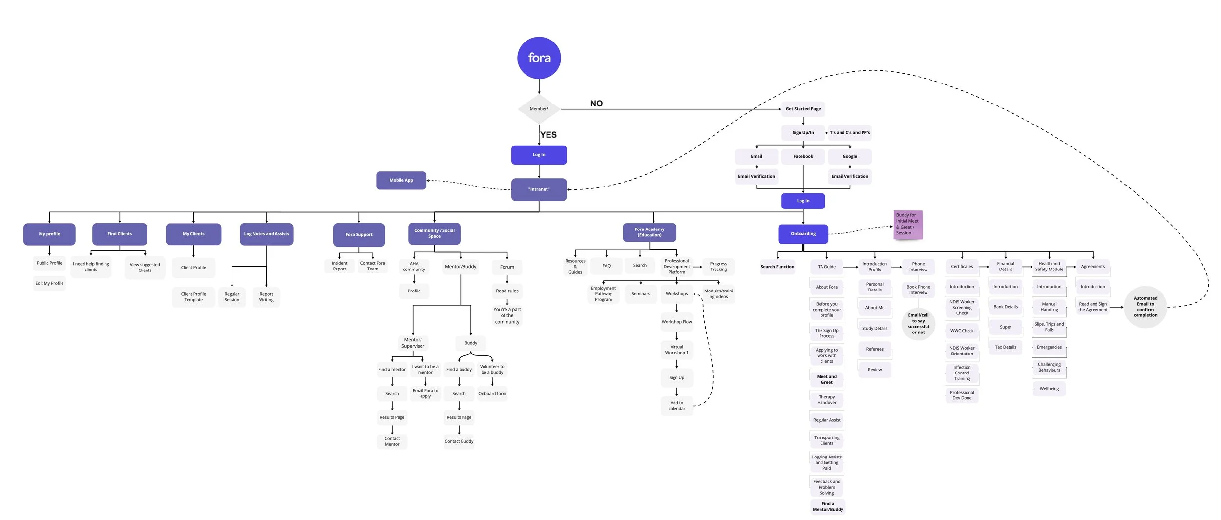
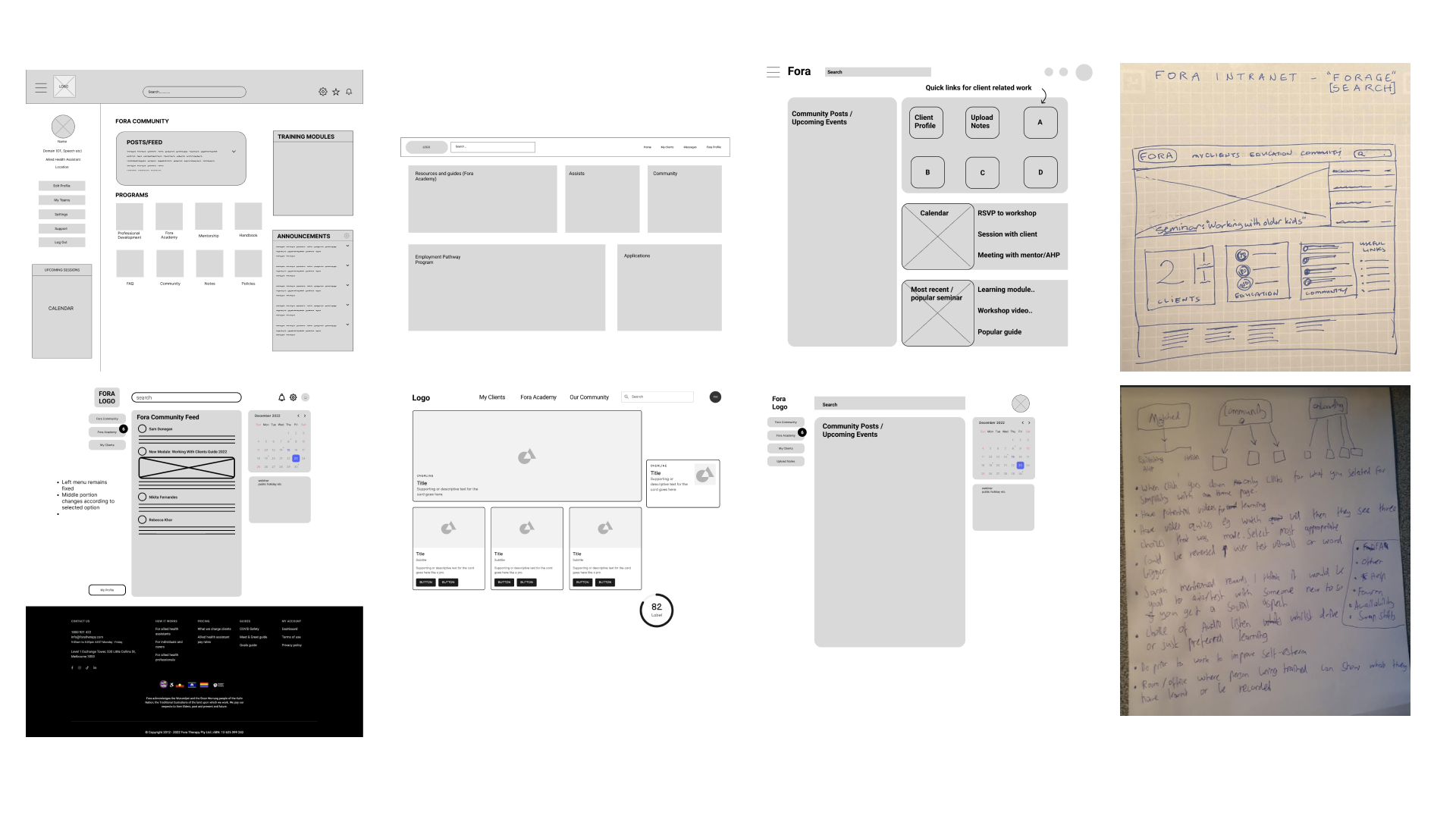
Once the information architecture was defined, as a team we created sketches and wireframes of the features defined in the information architecture. I contributed to creating wireframes using Figma.
I contributed to these tasks & artefacts in the design phase:
Co-hosted an ideation / co-design workshop with 4 Ashas (allied health workers)
Minimum Viable Product (MVP) Matrix
Hosted meeting with the stakeholders to clarify feasibility and viability of MVP
Information Architecture
Wireframes
Delivering the Solution
I contributed to these tasks & artefacts in the delivery phase:
Prototypes (‘Learning Platform’ feature @ low, medium & high-fidelity)
Usability Testing Script + Creating Tasks & Exercises
Conducting 2 Usability Testing Workshops (1x low-fidelity & 1x high-fidelity)
Hosted meeting with the stakeholders to gain approval for the expanded colour palette
Checking Accessibility against W3C WCAG 2.1 Guidelines
Carrying out a Heuristic Evaluation of the prototype
I organised another meeting with Fora and our team to discuss which sketches and wireframes addressed Asha’s pain points most effectively and was part of the UI team who designed the prototype (the ‘learning platform’ feature)- starting at low fidelity then later on moving onto medium & high fidelity. At this stage I also contributed to creating the usability testing script and formulated the tasks & exercises we were going to run through with our Ashas in testing- which would be used to gauge how easy it was to find key features & tools on our prototype.

I was also part of the testing team (carrying out 2 usability testing workshops at low & mid fidelity), where we tested our prototype with multiple Asha’s at each iteration/fidelity to ensure our designs and features were addressing her pain points effectively.
We ran through 6 tasks with our Ashas in the workshops to see how easily features were to locate and also asked questions about the general aesthetic, feel and usability of the platform. Further, we utilised a System Usability Scale (SUS) measured by a survey to gather scores on how our prototype performed at each iteration.
Usability Testing


We gathered all the testing quant and summed them into an average System Usability Scale score for each stage of fidelity; and experienced positive scoring improvements at each iteration.

Expanding the Design System

We’d received several comments in our testing workshops that the existing colour palette was at times ‘intense’ and ‘monochromatic’, so in our mid-to-high fidelity iteration, we decided to expand the palette with some ‘soft’ complementary colours. These were tested with 4x Ashas in workshops who all approved. We then shared & discussed the new palette & user-validation metrics with Fora who approved the new colour scheme, additionally advising that the new colours must, at a minimum, all pass AA ratings as per WCAG 2.1 accessibility guidelines (for normal text) when utilised in prototypes.

Accessibility (W3C WCAG 2.1)

As the Fora platform is at times also used by people living with a disability, we ensured we followed WCAG 2.1 guidelines to optimise the platform’s usability, accessibility & inclusive design. This included achieving, at a bare minimum, AA ratings for colour contrast ratios (for normal text), implementing visual feedback cues & animations to signify actionable buttons; utilising plain language to facilitate understandability; and ensuring all buttons were at least 44x44 pixels to ensure adequate sizing for interaction for usability as per guidelines.

Prototype
Our prototype can be tested above
(best viewed on laptop or desktop, please ensure you toggle fullscreen by clicking the icon located top-right inside the frame and
select ‘fit to screen’ or ‘fid to width’)
Or simply click here to open the prototype in a new window!
Outcome
Fora implemented an internal operational change based off our research findings around the client-matching process being a pain point for allied health assistants.
They addressed this area by modifying the process by which clients are suggested to AHAs, to ensure more personalisation and relevance in matching, which ideally will result in more compatible & longer-lasting AHA-client relationships.
Further, our research had validated several assumptions Fora had around the lack of community & professional development + mentoring opportunities, especially in the realm of connection between AHAs & allied health professionals (AHP).
Next Steps
As we wrapped up the first phase of the project, 4 primary next steps were identified as areas to focus on for the next phase:
Build a mobile web-responsive version of the Fora platform, as our quantitative research found 39% of Fora AHAs prefer using mobile. (Short-medium term)
Interview more Allied Health Professionals (AHPs) in order to best gauge how to establish the mentorship & buddy-up program. (Short-medium term)
Further testing and iteration of the prototype to ensure the learning platform, onboarding & community features are polished and optimised for our Ashas! (Short-medium term)
Interview Fora’s clients living with a disability & their carers, to gauge their expectations around allied health workers which could solidify learning materials. (Short-medium term)
Implement buddy pairing system, connecting AHAs with other AHAs & AHPs for support & professional development. (Medium-long term)
Retrospective
Looking back, we identified 2 areas we could’ve improved upon to ensure an even better project delivery:
We centred our qualitative research around internal Fora allied health assistants (AHA) but could’ve approached AHAs on external networks e.g. Universities, Facebook & Linkedin sooner, to gather more:
Data earlier on
Perspectives from non-Fora AHAs to mitigate potential bias
Testing prototypes on a low-resolution setting:
Ensures features aren't cut off, responsive design across low & high-resolution displays
We had one usability testing workshop with a participant using an older laptop set to a lower resolution which inadvertently hid a button from the side navigation bar.